 admin
|7 years ago|
1 Minute Read
admin
|7 years ago|
1 Minute Read
Unlike the other Learning Management Systems (LMSs), Moodle is ahead of the crowd in employing the technology to improve the world through education. Despite its Achilles’ heel, poor UI/UX design, Moodle has no turning back. Meanwhile, over the years, the Open Source LMS platform has started addressing that issue. The proof is the new theme introduced in Moodle 3.7 version.
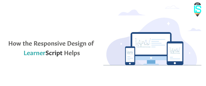
The primary goal of a responsive theme is to make the learning on Moodle happen at any time, anywhere and on any device. And that’s what LearnerScript is!
Because according to Statista, a German online portal for statistics, 3.9 bn of the 8 billion world population is active on the internet, as of July 2019. That is 48 percent of the global population browse the net to access web pages. And by 2021, the Mobile phone internet user penetration in the United States is going to be at 92 percent.
Going by those statistics, you can understand the importance of the responsive design of any software. And that’s what makes us build this Moodle learning analytics plugin to have look and feel of – One Tool, but Many Devices.
The Bootstrap theme and the skillful design of the product are the primary contributing factors to the responsiveness of LearnerScript.
Through the responsive design of LearnerScript, your users can access their LMS reports and SCORM (right in their inbox), get instructions of messages from their teacher, participate in learning activities like assignments and quizzes, switch between roles if you manage multiple roles, and the list of things you can do due to the responsive design of LearnerScript continues.


