The Moodle User Access Reports form a group of simple yet quite useful ones from the Moodle analytics point of view. There’re four quick User Access Reports to present to you through this blog post.
These reports throw some light for quick insights to the questions that start with what, where, which, and how many in Moodle learning analytics.
We think (because it’s not sure!) that these Moodle reports may commonly available in Moodle analytics tools. If not, visit the demo website of LearnerScript and get more information about them.
Now let’s see what those four User Access Reports are for Moodle LMS.
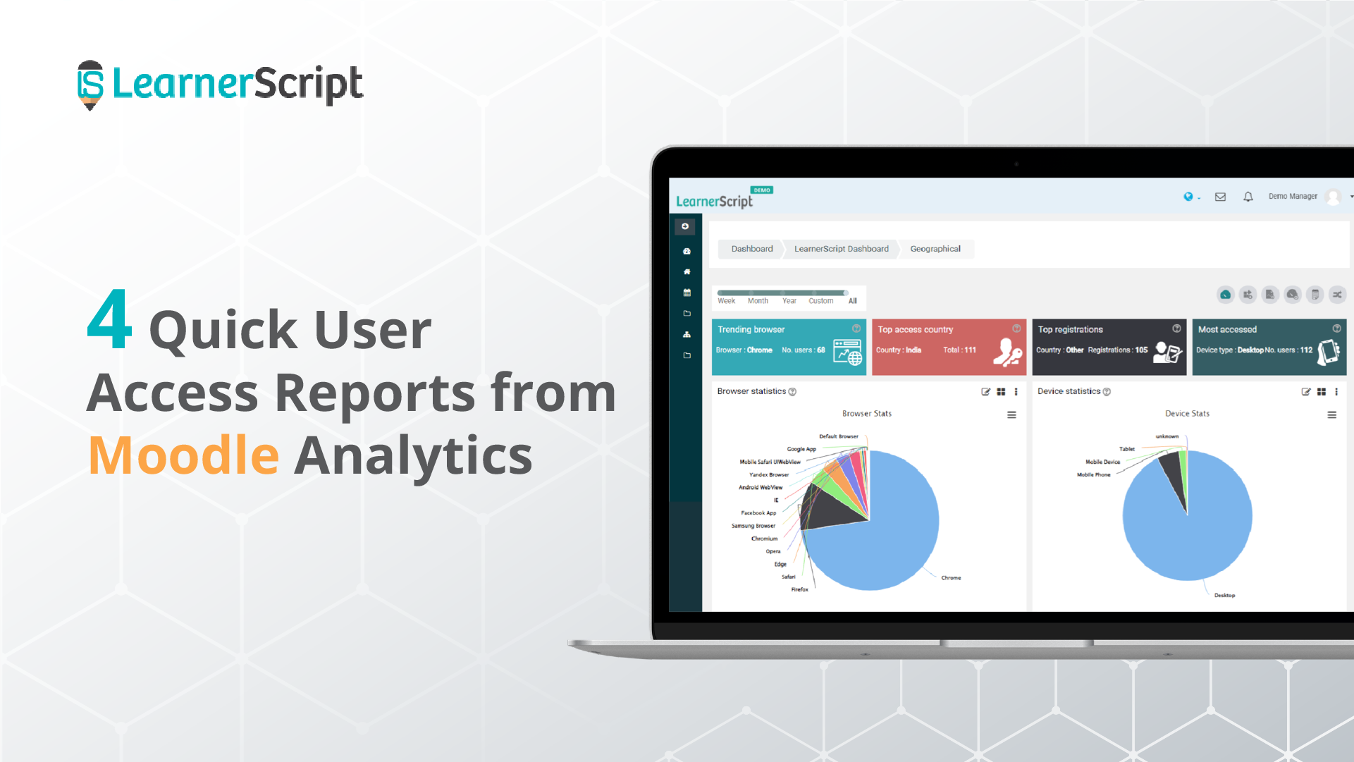
#1. Browser Stats
One of the common reports of Moodle learning analytics, right? This Moodle report answers a question that starts with ‘what.’ That is, “What browser is frequently used to access your Moodle site by your learners?” What percentage of users are accessing through a particular browser? And the questions like that.
Check out the percentage for each browser like Chrome, Safari, Yandex, Opera, Facebook App, and others.
Based on the percentage of users’ accessing, you’ll conclude the trending browser for your Moodle site. Of course, you’ll see the number of users accessing your Moodle through that ‘trending’ browser.
To get more information or idea about this Moodle, visit the demo website of LearnerScript.
#2. Device Stats
The device stats report answers the question that begins with – which device? Unlike the many browsers, the devices will be a few, right? So you can easily figure out the most used device to access your Moodle site.
The report shows you the type of device by and large, but not the brand name of the device. You can have it by customizing the Moodle report if you’re particular about it.
Like the ‘trending browser,’ get the percentage of the accession for each device. So you can figure out the most used device.
All these stats are visually presented on Pie charts on LearnerScript.
#3. Country-wise Registrations
The country-wise registrations report gives you insights into the number of course registrations from various parts of the globe. This Moodle report is an answer to the question – how many?
The following description is based on how this Moodle report looks like on LearnerScript.
The registrations that occurred from a country will be seen with a shade of a colour. The intensity of the hue tells us about the registrations happening on your Moodle. If no colour, means almost nil enrolments. The darkest shade represents the highest number of admissions from that region.
So from the report, you can draw a conclusion: the country of the top registrations along with the count.
If you couldn’t make anything from the preceding paragraph, visit the demo site of LearnerScript and get the idea of what we’re talking about here.
#4. User Access Location
The user access location report tells you about the location of users from where they’re accessing your Moodle site.
This report is one of the common reports available (we assume so!) across the learning analytics tools. (If not, check it out on LearnerScript.)
The location hue changes from white color, meaning a few or nil, to the darkest shade, meaning the most accessed location. So you’ll also get the number of users (highest or lowest) of a location.
Therefore, have a Moodle statistics report for the most accessed country from the Moodle analytics.
That’s all about the Moodle User Access Reports. They’re pretty simple and quick to give you insights into learning analytics.
For more information about these types of Moodle analytics, visit the demo website of LearnerScript. Or contact us for a personal demonstration of the tool.